


Abstract
QtitanRibbon is a collection of widgets (control elements) that will help you quickly and easily add a next-gen user interface to your application (see Figure 1). The product is completely based on Qt SDK.
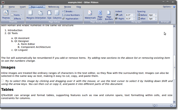
Figure 1. Qtitan Ribbon implementation.
We use several innovative approaches to offer you the best and the most comprehensive UI solution on the market. Some of its most valuable features are:
-
Completely identical to Microsoft Ribbon in terms of functionality
-
Easy to integrate into an existing or new application
-
A wide choice of styles, including Office 2007, Office 2010 (Blue, Silver, Black, Aqua). Office 2013 is under development.
-
An optimized paint engine
-
100% Qt code, support of Windows and Linux systems without restrictions
QtitanRibbon was written in C++ using Qt SDK and supports:
- Visual Studio 2003
- Visual Studio 2005
- Visual Studio 2008
- Visual Studio 2010
- Visual Studio 2012
- Qt Creator
- any other IDE's the Qt product integrates into.
- Qt 4.5 - 4.8, Qt 5 (32bits/64bits)
- Windows, Linux, Mac OSX
QtitanRibbon elements
Ribbon
Ribbon is the main element of the user interface and contains several tabs.
The content of each tab is organized into groups (see Figures 2, 3).
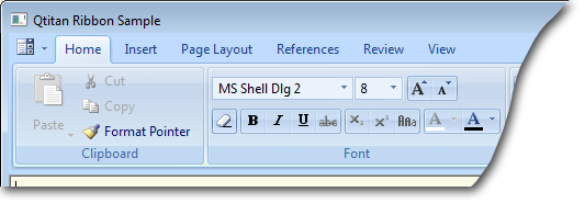
Figure 2. Main tab selection.
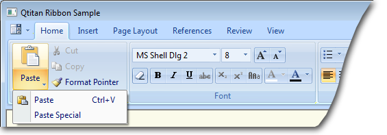
Figure 3. Selection of the main tab and activation of the context menu.
Groups
Groups allow you to automatically position widgets. Another useful feature of a group is its ability to minimize whenever the ribbon width is changed, yet providing access to all of its features.
(see Figure 4).
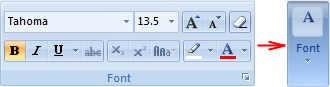
Figure 4. Group positioning depending on the ribbon width.
When a group is minimized, the user can access its control elements using a popup window that can be opened by left-clicking on the group (see Figure 5).
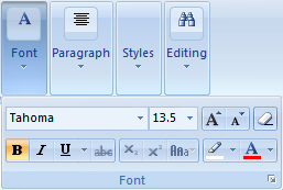
Figure 5. The control elements of a minimized group are accessible.
System button
The button in the top left corner of the ribbon opens the application menu (see Figure 6).
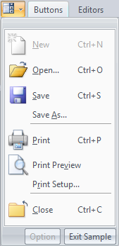
Figure 6. System button.
MDI
QtitanRibbon supports MDI (Multiple Document Interface) (see Figures 7, 8).
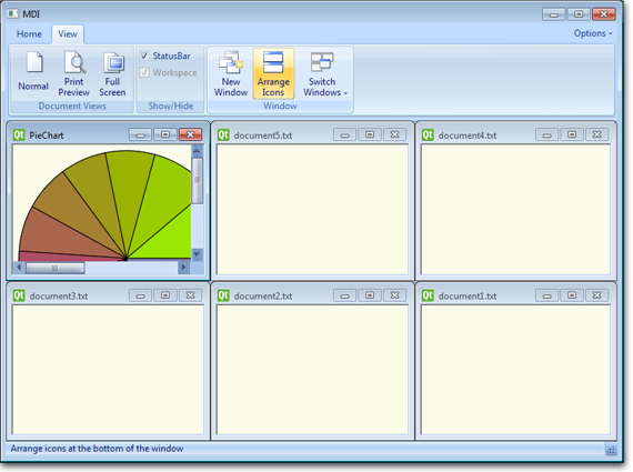
Figure 7. Arranging the application's child windows.
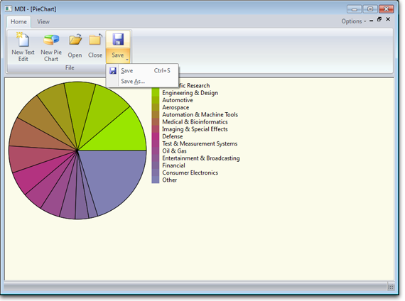
Figure 8. The child window of the application is maximized.
You can also use MDITabs that will allow you to manage child windows.
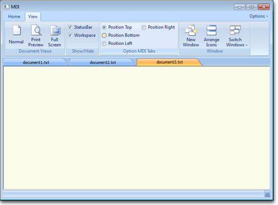
Figure 9. Using MDITabs
QtitanRibbon Styles
The following style are supported:
-
Offi?e 2007 Blue (see Figure 10)
-
Offi?e 2007 Silver (see Figure 11)
-
Offi?e 2007 Black (see Figure 12)
-
Offi?e 2007 Aqua (see Figure 13)
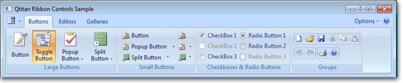
Figure 10. Offi?e 2007 Blue.
Figure 11. Offi?e 2007 Silver.
Figure 12. Offi?e 2007 Black.
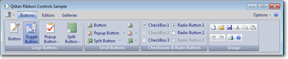
Figure 13. Offi?e 2007 Aqua.
You can use the styles listed above in the classic view of the Qt user interface (see Figure 14) so the all Qtitan's styles is inherited from QStyle.
Figure 14. Support of the Offi?e 2007 style and its theme.
Control elements (widgets)
Each control element of Qtitan Ribbon was developed in compliance with the following requirements:
-
A control element can be used in different contexts - for instance, on a ribbon, on a form and in a popup menu
-
If possible, a control element should not be a window - it saves system resources and prevents a number of problems
-
A control element should have several visual representations. For instance, if used on a ribbon, a control element can be used both with a large and small icon, with text or without it. When the ribbon changes it width, the elements should react to it accordingly.
Button
The button offers the following usage options:
-
Support of a popup menu (ToolButtonPopupMode)
-
KeyTip support
-
ScreenTip support
-
Support of changeable Enabled, Checkable states
-
Support of ToolButtonStyle display
-
Aligning of text and images
You can preview buttons on the ribbon depending on their size and current state (see Figure 15).
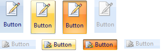
Figure 15. Button states.
Pupup button
A button with a popup menu enables the user to select a command from the list (see Figure 16).
It also offers the following capabilities:
• KeyTip support
• ScreenTip support
• Support of changeable Enabled, Checkable states
• Support of ToolButtonStyle display
• Aligning of text and images
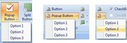
Figure 16. Possible states of a button with a context menu.
The button has mixed capabilities (see Figure 17, 18). It can work in two modes - as a regular button and a button with a popup menu. The button enables the user to select a command from the menu list and has the following properties:
-
KeyTip support
-
ScreenTip support
-
Support of changeable Enabled, Checkable states
-
Support of ToolButtonStyle display
-
Aligning of text and images
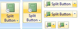
Figure 17. Split Button state options.
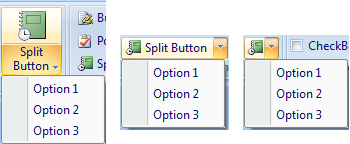
Figure 18. Split Button state options.
Button group
You can join small buttons into a group (see Figure 19).
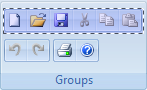
Figure 19. Button group.
Check Box and Radio Button
Check Box and Radio Button offer the capabilities of a regular QCheckBox and QRadioButton (aee Figure 20):
-
can be used both on a ribbon and a form
-
KeyTip support
-
ScreenTip support
-
Support of changeable Enabled, Checkable states
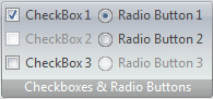
Figure 20. Check Box & Radio Button state options.
ComboBox
ComboBox also has all the capabilities of a regular QComboBox (see Figure 21):
-
can be used both on a ribbon and a form
-
KeyTip support
-
ScreenTip support
-
Support of changeable states
-
Text Box support
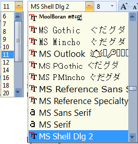
Figure 21. ComboBox state options.
Slider
The Slider control element enables the user to change the values within a set range:
-
Can be used both on a ribbon and a form
-
Support of changeable states (see Figure 22, 23)
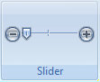
Figure 22. Use of the Slider component in a ribbon group.
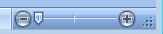
Figure 23. Use of the slider component in the status bar.
SpinBox (Numeric Up-Down)
SpinBox allows the user to change its value and has two buttons - increment and decrement. The component offers the following capabilities:
-
can be used both on a ribbon and a form
-
KeyTip support
-
ScreenTip support
-
Support of changeable states
-
Text Box support
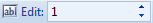
Figure 24. SpinBox in Qtitan Ribbon.
ScrollBars
Horizontal and vertical scrolling can be managed according to the currently selected theme and can be used both on a ribbon and on a form.
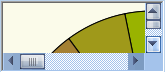
Figure 25. Managing horizontal and vertical scrolling.
Label
Although all control elements support their own text, it's still more convenient to use Label in some cases. Capabilities:
-
can be used both on a ribbon and a form
-
display of text and images (see Figure 26)
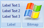
Figure 26. Displaying text and images using Label.
TabControl
The appearance of QTabBar, a regular control element, is defined by the currently selected theme.

Figure 27. TabControl in QtitanRibbon.
StatusBar
The look of the standard status bar (QStatusB?r) also depends on the currently selected theme.
You can also use the following control elements in the status bar:
-
Push button
-
Toggle button
-
Progress bar
-
Slider
-
Label

Figure 28. StatusBar in QtitanRibbon.


